Until recently, I didn’t give much thought to the connection between healthcare and digital innovation. I imagine most people probably don’t think about this on a daily basis.
But when a family member had a health scare, I realized how frustrating it is to navigate outdated medical websites and unresponsive patient portals. That’s when I started looking into what goes into creating a healthcare website that actually works.
It turns out that healthcare is undergoing a massive digital transformation right now, essentially rethinking the entire digital patient journey from the initial Google search to post-visit follow-ups, and ensuring that technology isn’t a barrier to care.
So, let’s talk about where healthcare is headed and what makes for a truly good website in this space.
Major Trends Driving Healthcare’s Digital Makeover
Here are some of the biggest trends I’ve noticed that are shaping how healthcare shows up in the digital world today.
Telehealth Has Become the Norm
Ever since the pandemic forced healthcare online, virtual care has become a basic expectation. Now, if a provider doesn’t offer video appointments, online booking, or some kind of digital communication, patients notice.
Thedigital transformation market in healthcare is valued at approximately $4.6 billion in 2025 and is forecasted to exceed $10 billion by 2032, underscoring the rapid investment by hospitals and clinics in telehealth, digital records, and remote monitoring.
Patient Expectations Have Shifted
Healthcare isn’t exempt from the “Amazon effect.” People want fast access, clear information, and smooth experiences. That means sites need to load quickly, work on mobile, and guide users intuitively.
Data Security and HIPAA Compliance Are Front and Center
If someone’s entering their health history or booking an appointment through your platform, they need to know their data is safe. Secure forms, encrypted messaging, and visible privacy policies are no longer optional.
Accessibility Matters More Than Ever
That means thinking about color contrast, screen reader compatibility, keyboard navigation, and content that’s readable at all literacy levels.
What Makes a Great Healthcare Website?
After exploring dozens of healthcare sites, I began to notice some patterns. Here’s what the best ones get right.
1. Clear, Clean Design
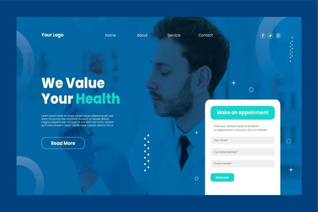
Simplicity is key. When someone is sick, stressed, or searching for urgent info, they don’t want to click through six menu layers. The best sites use whitespace effectively, highlight essential information (such as hours and contact details), and make navigation feel effortless.
2. Actionable Content
Good websites speak directly to patients: What symptoms should you look out for? How do you prepare for your appointment? Where do you go for urgent care? Helpful blog posts, FAQs, and service pages can turn a passive site into an active resource.
3. Intuitive UX for Both Patients and Staff
Online appointment booking should not feel like tax season. The user journey needs to be simple: pick a service, pick a provider, choose a time, done. And on the backend, staff should be able to manage content and data without jumping through hoops.
4. Mobile-First Design
This can’t be emphasized enough. Many people access healthcare sites from their phones. If the mobile site is broken, clunky, or slow, you’re turning people away before they ever reach your waiting room.
5. Trust-Building Elements
Photos of real staff, testimonials from patients, certifications, and clear contact information all contribute to credibility. It’s about creating a digital experience that feels just as caring and trustworthy as an in-person visit.
Lessons Learned From the Front Lines
If you’re involved in digital strategy or marketing in the healthcare space, you need to know that user experience is patient experience. The two aren’t separate anymore. A confusing, outdated, or impersonal website can do real damage, not just to your brand, but to people’s health outcomes.
That’s why I believe that creating a healthcare website is now a healthcare challenge, not just a design challenge as it once may have been. The digital front door is often the first point of care. Get it right, and you make someone’s life easier when they need it most.
Get it wrong, and, well... they’re back to waiting on hold.
Disclaimer: This post was provided by a guest contributor. Coherent Market Insights does not endorse any products or services mentioned unless explicitly stated.


